pax_global_header�����������������������������������������������������������������������������������0000666�0000000�0000000�00000000064�11730201604�0014504�g����������������������������������������������������������������������������������������������������ustar�00root����������������������������root����������������������������0000000�0000000������������������������������������������������������������������������������������������������������������������������������������������������������������������������52 comment=385e3b294acbb359a4bec41e1e340873a991bcf0
����������������������������������������������������������������������������������������������������������������������������������������������������������������������������������������������������������������������������������������������������������������������������������������������������������������������������������������������������������������������������������������������������������������������������������������������������������������������������compass-fancy-buttons-plugin-1.1.1~20120313/��������������������������������������������������������0000775�0000000�0000000�00000000000�11730201604�0020251�5����������������������������������������������������������������������������������������������������ustar�00root����������������������������root����������������������������0000000�0000000������������������������������������������������������������������������������������������������������������������������������������������������������������������������compass-fancy-buttons-plugin-1.1.1~20120313/.gitignore����������������������������������������������0000775�0000000�0000000�00000000136�11730201604�0022244�0����������������������������������������������������������������������������������������������������ustar�00root����������������������������root����������������������������0000000�0000000������������������������������������������������������������������������������������������������������������������������������������������������������������������������example/.sass-cache/
example/stylesheets/
example/sass/.sass-cache
*.gem
.bundle
Gemfile.lock
����������������������������������������������������������������������������������������������������������������������������������������������������������������������������������������������������������������������������������������������������������������������������������������������������������������������������������������������������������������������������������������������������������������������������������compass-fancy-buttons-plugin-1.1.1~20120313/.rvmrc��������������������������������������������������0000664�0000000�0000000�00000000035�11730201604�0021401�0����������������������������������������������������������������������������������������������������ustar�00root����������������������������root����������������������������0000000�0000000������������������������������������������������������������������������������������������������������������������������������������������������������������������������rvm 1.8.7-p302@fancy-buttons
���������������������������������������������������������������������������������������������������������������������������������������������������������������������������������������������������������������������������������������������������������������������������������������������������������������������������������������������������������������������������������������������������������������������������������������������������������������������������������������������������compass-fancy-buttons-plugin-1.1.1~20120313/CHANGELOG.markdown��������������������������������������0000664�0000000�0000000�00000011750�11730201604�0023310�0����������������������������������������������������������������������������������������������������ustar�00root����������������������������root����������������������������0000000�0000000������������������������������������������������������������������������������������������������������������������������������������������������������������������������# Fancy Buttons Changelog
## 1.1.1
- Now requires Compass 0.11 or higher
- Compass CSS3 mixin usage was updated to work with the improved syntax in 0.11
## 1.0.6
- Now removes inset box shadow styling from disabled buttons
- Fixed: typo in variable $fb-allow-disabled (was sometimes $fb-allow-disable)
## 1.0.5
- Failed at being as cool as 1.0.6. Yanked as punishment.
## 1.0.4
- The naming pattern for gradient mixins which style the :active state has changed from *invert*-fancy-gradient to fancy-gradient-*active*.
- Fixed: If button has a different color for the :active state, the inset shadow is based on that color.
- Removed: $fb-inset option. Buttons look better with it always true. The code to keep this option is just ugly.
- Removed: $fb-invert-on-click option. There is no reason not to invert the button.
## 1.0.3
- Improved inset box shadow for a nice depressed look on :active states.
## 1.0.2
- Added inset box shadow for improved button beauty! (if you don't like it, you can set $fb-inset: false)
- Added background-clip to help with bleeding backgrounds under rounded corners in webkit
## 1.0.1
- Fixed a bug in `fancy-button-text-colors` (it works now)
## 1.0
- **Changes that affect your current style**
- The mixin fancy-arrow was removed, I don't think anyone ever used this.
- Removed doubled border on :active state (caused lots of CSS bloat for minimal visual effect).
- Disabled styling is now off by default. `$fb-allow-disabled: false !default`. If you're using disabled styling, set this to true and you won't notice any changes. If not, your CSS output may be shrink quite a bit!
- **Improvements/Fixes**
- Disabled styles are much leaner
- Button reset uses `@extend` to make sure all fancy buttons get styles reset in one location
- New variable: `$fb-line-height: 1.2em !default` allows you to set a default button line-height.
- New Mixin: `disable-fancy-button` allows you to set the color and opacity for disabled button states. This is best used with a 'disabled' class name, or disabled attribute selector.
- Source is now dasherized (won't affect your usage, just makes it nicer for me)
- Imports to Compass library now only use the minimum necessary css3 modules
- Added support for RVM gem sets and bundler to aid development of fancy-buttons (doesn't affect users)
## 0.5.5
- Removed template files
- Added `$fb-allow-disabled` variable - defaults to true (credit: Chris Eppstein)
Now you can toggle the output of styling for disabled buttons or links with the class "button disabled".
This is useful if you want to reduce the size of your css and won't be using the disabled feature.
## 0.5.4
Updated old linear-gradient syntax in the example
## 0.5.3
- Deprecated @import fancy_button.sass in favor of syntax agnostic and dashed import @import "fancy-buttons"
- Added :visited override to avoid incorrect colors in link buttons
## 0.5.2
Updated requirements to include latest stable versions of Haml and Compass
## 0.5.1
Fixed an overzealous .gitignore rule where essential stylesheets were being excluded from the gem. Oh my!
## 0.5
Updated to use Sass3 syntax, this requires the latest pre-releases of both Haml and Compass which should be automatically installed for you.
**Note: you may need to update your system with `sudo gem update --system` if you're not running ruby gems 1.3.6**
## 0.4
**Now Supporting the latest FireFox gradients**
Note: You'll need Compass 0.10 (pending release) or 0.10.0.pre8 (if you're bleeding edge like me)
## 0.3.9
minor bug fixes
## 0.3.8
New:
* !fb\_image\_path allows users to specify an alternate image or image path than the default
* IE6 conditional stylesheet included (removes png background image)
## 0.3.7
* Mundane fixes which I've forgotten.
## 0.3.6
New:
* CSS gradients can be disabled using !fb_gradient = 0 (mostly for testing purposes)
Fixes:
* Background color for buttons lighter than #aaa have been lightened to more closely match the gradient version.
## 0.3.5
New:
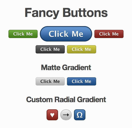
* Use your own custom gradients (horizontal, vertical, or radial)!
* New matte gradient
* Improved gradient click style (looks inverted)
* Set project-wide gradient type !fb\_gradient\_type = "glossy", "matte", "custom" (default is glossy)
* Directly specify button padding with +fancy-button-padding(h\_padding, v\_padding, {border\_width})
* New demo showing glossy, matte, and custom gradients (includes a radial gradient demo)
Fixes:
* Fixed Text color flicker when using functions with borderline luminosity
Changes:
* **Important:** * You must use `sudo gem install compass --pre` since rubygems doesn't install prerelease gem versions automatically.
* **Important:** Global defaults have changed from the prefix "!default\_button\_" to the prefix "!fb_". If you were using global project defaults
update them or your buttons will break with this update. The reason for the change was to use a more specific namespace
to avoid global variable interactions.
* Now requiring Haml 2.2.14 and Compass 0.10.0.pre2 (for new gradient mixin)
������������������������compass-fancy-buttons-plugin-1.1.1~20120313/Gemfile�������������������������������������������������0000664�0000000�0000000�00000000046�11730201604�0021544�0����������������������������������������������������������������������������������������������������ustar�00root����������������������������root����������������������������0000000�0000000������������������������������������������������������������������������������������������������������������������������������������������������������������������������source "http://rubygems.org"
gemspec
������������������������������������������������������������������������������������������������������������������������������������������������������������������������������������������������������������������������������������������������������������������������������������������������������������������������������������������������������������������������������������������������������������������������������������������������������������������������������������������compass-fancy-buttons-plugin-1.1.1~20120313/README.markdown�����������������������������������������0000664�0000000�0000000�00000002443�11730201604�0022755�0����������������������������������������������������������������������������������������������������ustar�00root����������������������������root����������������������������0000000�0000000������������������������������������������������������������������������������������������������������������������������������������������������������������������������## Using fancy buttons on your site?
Add a link to the [wiki](http://wiki.github.com/imathis/fancy-buttons)
## Demo

Without CSS gradient support:
## Install
Install the plugin: (should automatically install latest dependencies for Compass, and Haml)
gem install fancy-buttons
To create a new project based on fancy-buttons:
compass install -r fancy-buttons -f fancy-buttons
To add fancy-buttons to an existing compass project:
# Add the following lines to your compass configuration file:
require 'fancy-buttons'
# Then run the following command:
compass install -r fancy-buttons -f fancy-buttons
# Project Goals:
- Generate a color palette from the base color
- Discern sensible palette variations based on a base color (dark, medium, light)
- Allow button style types (subtle gradient, shiny gradient)
- Make it easy to override/modify styles
- Reduce weight of generated styles (define button base, add color through additional classes)
- Create good defaults
- Ensure approximate consistency for browsers that don't support CSS gradients
- Style the button element
- Provide a decent alternative styling for ie6�����������������������������������������������������������������������������������������������������������������������������������������������������������������������������������������������������������������������������compass-fancy-buttons-plugin-1.1.1~20120313/Rakefile������������������������������������������������0000664�0000000�0000000�00000000042�11730201604�0021712�0����������������������������������������������������������������������������������������������������ustar�00root����������������������������root����������������������������0000000�0000000������������������������������������������������������������������������������������������������������������������������������������������������������������������������require 'rubygems'
require 'rake'
����������������������������������������������������������������������������������������������������������������������������������������������������������������������������������������������������������������������������������������������������������������������������������������������������������������������������������������������������������������������������������������������������������������������������������������������������������������������������������������������compass-fancy-buttons-plugin-1.1.1~20120313/VERSION.yml���������������������������������������������0000664�0000000�0000000�00000000062�11730201604�0022117�0����������������������������������������������������������������������������������������������������ustar�00root����������������������������root����������������������������0000000�0000000������������������������������������������������������������������������������������������������������������������������������������������������������������������������---
:major: 1
:minor: 1
:patch: 1
:state:
:build:
������������������������������������������������������������������������������������������������������������������������������������������������������������������������������������������������������������������������������������������������������������������������������������������������������������������������������������������������������������������������������������������������������������������������������������������������������������������������������compass-fancy-buttons-plugin-1.1.1~20120313/example/������������������������������������������������0000775�0000000�0000000�00000000000�11730201604�0021704�5����������������������������������������������������������������������������������������������������ustar�00root����������������������������root����������������������������0000000�0000000������������������������������������������������������������������������������������������������������������������������������������������������������������������������compass-fancy-buttons-plugin-1.1.1~20120313/example/button-advanced.html����������������������������0000664�0000000�0000000�00000000744�11730201604�0025655�0����������������������������������������������������������������������������������������������������ustar�00root����������������������������root����������������������������0000000�0000000������������������������������������������������������������������������������������������������������������������������������������������������������������������������
Fancy Buttons - Advanced Demo